If you don’t use PowerPoint a lot, you might not fully appreciate why I love the new Selection Pane in PowerPoint 2007. I often need to play around with various objects on my slide, e.g. using animation effects to build a complex figure or highlighting certain aspects of the slide text.
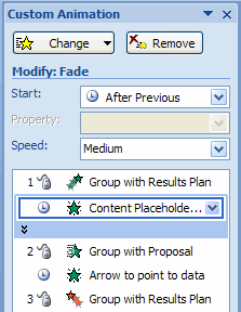
In previous versions of PowerPoint, with complex slides it was not easy to understand the animation sequence, as the shapes and groups in the Custom Animation Pane were labeled “Rectangle 14”, “Arrow 26” or “Group 31”. These names don’t help a lot when trying to get a complex animation right.
This is still the case in PowerPoint 2007, but you can easily change the name to something meaningful! To start, display the Selection Pane by clicking the Select button in the Home tab of the Ribbon: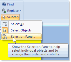 This will give you access to a pane on the right hand side of the screen, displaying all elements on the slide:
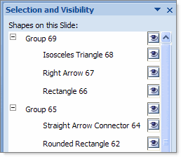 Double-clicking any of these elements will allow you to rename them (giving them a meaningful name):
 That way, it’s a lot easier to work with the Custom Animation sequence:
 Better yet, the Selection Pane also allows to select objects that are ‘behind’ other objects, e.g. to change the properties or to move them, without having to move the objects that are ‘above’ them.
An example will clarify this: suppose I have a slide with the Agenda of the presentation. I want to indicate that the next topic will be “Purpose of the Project” by putting a rounded rectangle behind the text: 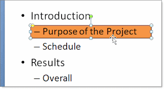 If I ever wanted to change something about the rectangle, like the color or custom animation, it was very difficult to select it in previous versions of PowerPoint: the text of the slide is in front of the rectangle, making it virtually impossible to select it. I had to move away the text or send the text “To Back” to get access to the rectangle. In PowerPoint 2007 it is as easy as selecting the rectangle in the Selection Pane!


