Reason #5 why I like Office 2007: using Slide designs/layouts in Powerpoint 2007

PowerPoint XP gave us ‘Multiple Masters’. Until then, we were limited to 2 master layouts: a Title master and a Content master. With multiple masters, we finally could create presentations with different, yet consistent background for different sections of our presentations.

The problem with multiple masters was that PowerPoint XP used a rather strange user interface for switching between the different masters. In Training sessions I gave, this topic always was one of the most confusing for trainees. You had to combine the “Slide Design” and “Slide Layout” panes in the Task Pane to get the layout you wanted, which was far from intuitive. PowerPoint 2003 did not improve in this area.

Finally, with PowerPoint 2007, Multiple Masters are really usable and pretty intuitive.
There’s no difference anymore between “Slide Design” and “Slide Layout”. When you need another layout, you simply click the “Layout” button. It will list all available layouts, for all masters in your presentation. With one click, you can change layout and/or master.
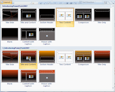
This is really an elegant solution to the complex issue of using Multiple Masters.
Reason #4 why I like Office 2007: the new file format

The new file format that Office 2007 uses is an XML-based file format, which is stored on the hard disk in a compressed format. A standard ZIP-compression is used, which means that you can open Office 2007 files in a zip-compatible application.

This opens a lot of possibilities, but what I really like about it is that you can easily extract images or other embedded documents out of Word, Excel or PowerPoint files.
Better yet, this (finally!) gives me an easy way to find out why a PowerPoint presentation has a huge file size, even though I used “Compress Pictures…” before I saved.

I could put this into practice today: a colleague asked for my help because he had a PowerPoint presentation with about 30 slides, some of which contained pictures, and the file size was 11MB. Too large to send as an e-mail attachment in our organization.

I first looked at the obvious things: no master slides that were not used, no pictures that were scaled down to 25% or less, all pictures compressed and cropped… nothing that would explain the 11MB.

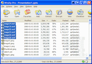
So I opened the file in PowerPoint 2007, saved it as an .pptx-file, opened that with WinZip and sorted the list on file size. The result? The presentation contained 6 images in .wmf-format, which apparently take a lot of space.

I could not have seen that in PowerPoint 2003: the images themselves were less than 300×300 pixels and were scaled at 100%, so everything looked OK.

After replacing the pictures with a .jpg-version, the PowerPoint presentation shrank to a mere 3 MB!

Reason #3 why I like Office 2007: Conditional Formatting Power in Excel

I teach about Office 2003 regularly, and whenever I demonstrate the Conditional Formatting options in Excel 2003, one of the first questions I get is “Great, but can you have more than 3 conditions?”. I have to disappoint people then, because the limit is 3. Until Excel 2007 arrived that is. In the new Excel 2007, you may have as many conditional formats as you like.

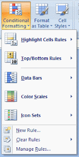
Better yet, a powerful series of commonly used Conditional Formatting rules are predefined, so visualizing information using color really is a matter of just a few clicks. The Conditional Formatting button also is prominently present on the Home tab of the Ribbon, an indication that the Excel team understands its power for users. I particularly like the Data Bars and Color Scales options:

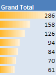
  • Data Bars display a color bar across cells to display the relative magnitude of values in a cell range. It makes is very easy to get a visual representation of your data:
  • Color Scales let you color cells using a color gradient. So you really can show subtle differences between numbers in different colors:

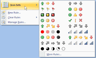
There are other options as well. I was excited about Icons Sets at first: it looked like the icons would allow for a nice indication of whether a value was going up or down:But I’m not so sure this option is as valuable as it looks like at first sight.
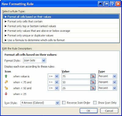
Suppose you have the following data about Sales in the first 5 months of the year:I’d like to use the 4 arrows option to quickly show whether data is going up or down, month by month. However, when I apply that arrow formatting on the range, this is the result:Not quite what I expected. The yellow arrows seems to indicate that February and March are better than January, but in fact, the trend is going down. Looking at the details of this predefined setup, I understand how Excel is using the arrows: They are used to represent a relative value in the whole range of the cells, not compared to the previous or next cell. I think this is confusing. There should be an easy way to use arrows indicating whether a value goes up, or down throughout a range, but I haven’t been able to figure out how to do that. If you do, please let me know.

Having said that, the Conditional Formatting improvements in Excel 2007 are huge! What I covered here is in fact only the tip of the iceberg.